Navigation
With Ghost you can add, edit and reorder navigation items. This guide will show you how to create and manage navigation items in your Ghost site.

The Aspect support Primary and Secondary navigation.
- Primary navigation is displayed in the sidebar
- Secondary navigation is displayed in the sidebar footer.
Manage navigation items
To manage navigation items, follow these steps:
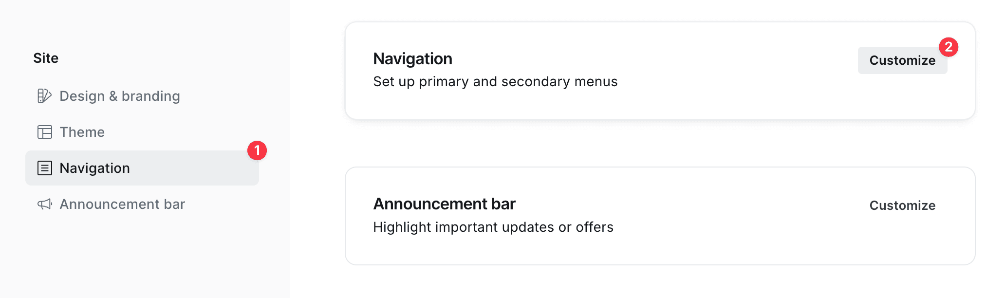
- Go to Settings → Site → Navigation
- Click Customize
Dropdowns
Our theme support dropdown menus in navigation, allowing you to organize related links under a parent item. This is useful for creating more complex navigation structures without cluttering the menu.
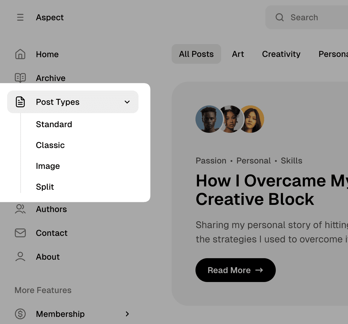
To create a dropdown menu:
- Add a parent item that will serve as the dropdown trigger
- Add child items by creating navigation items with labels that start with
-(dash followed by a space)
The items with labels starting with - will be nested under the previous regular navigation item.
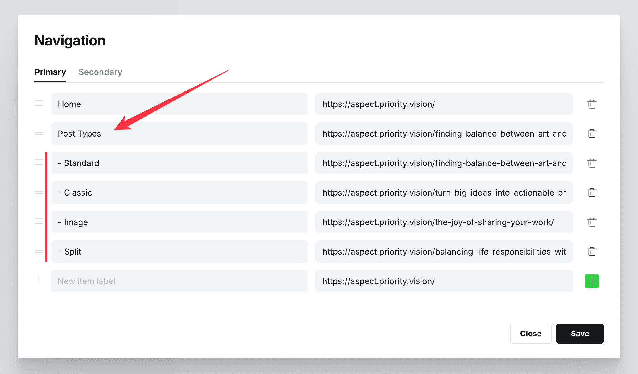
For example, to create a “Resources” dropdown with “Tutorials” and “Documentation” items:
- Add a regular navigation item with label “Resources”
- Add an item with label ”- Tutorials”
- Add an item with label ”- Documentation”
This will create a dropdown menu where “Tutorials” and “Documentation” appear when hovering over or clicking on “Resources”.
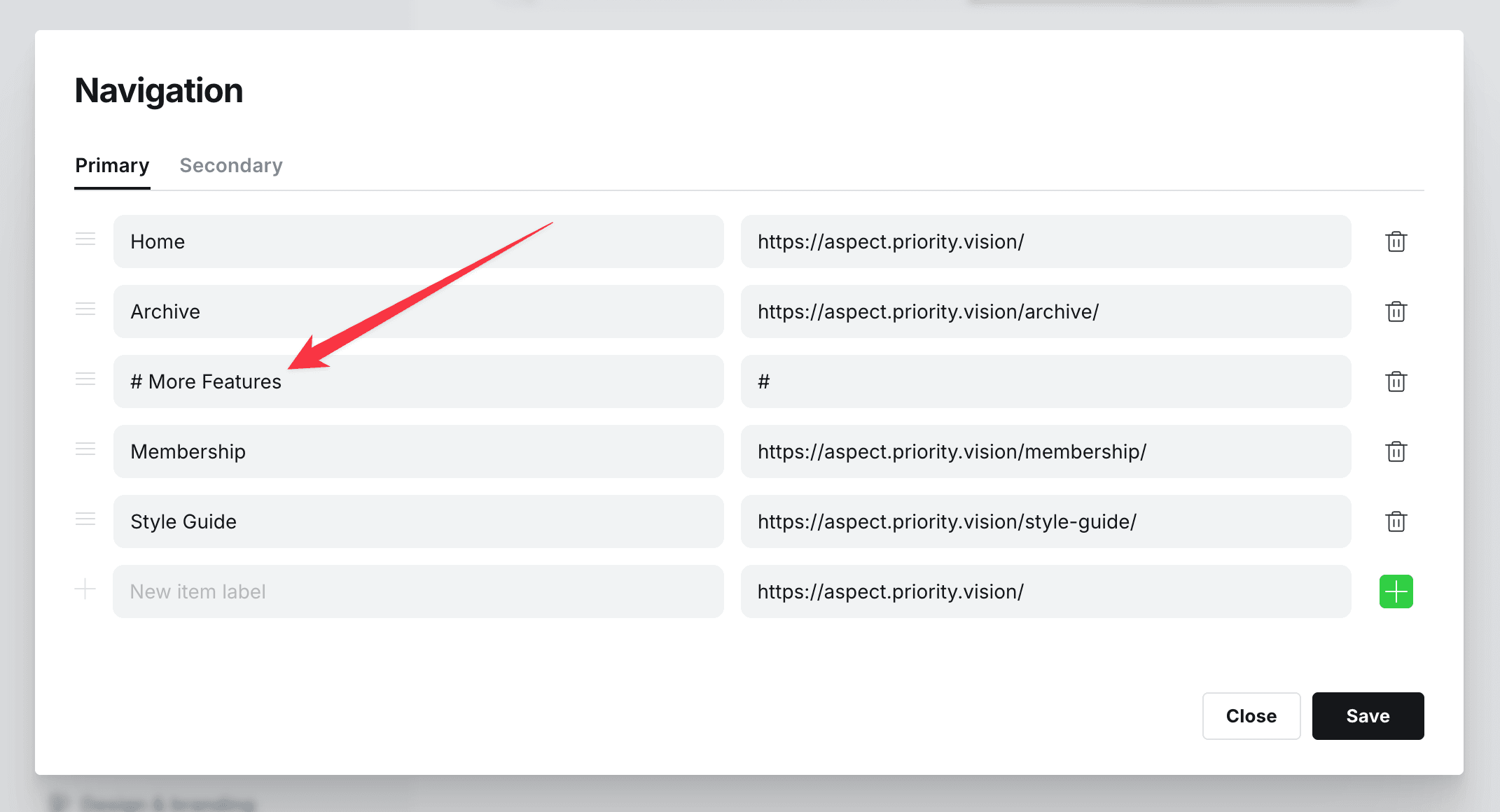
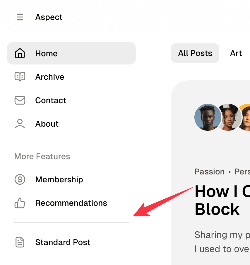
Sections
Aspect allows you to add sections with labels between navigation items. This is useful to separate different items to sections.
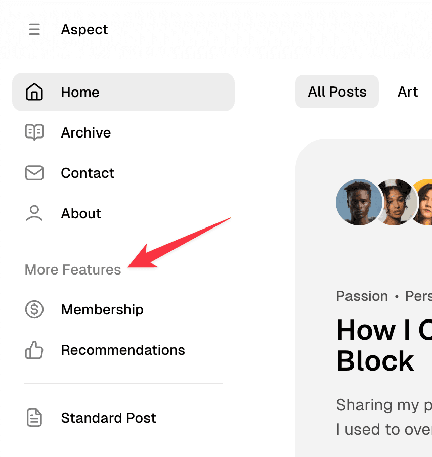
To add the section, create a new item with label starting with # and label. This item will be recognized as a separator.
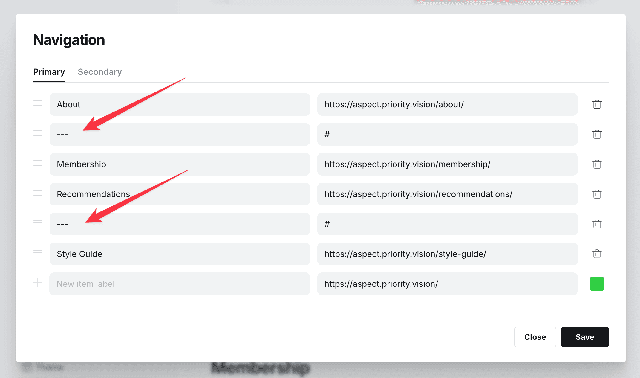
Separators
Aspect allows you to add a separator between navigation items. This is useful to separate different sections of your navigation.
To add the separator, create a new item with label --- and this item will be recognized as a separator.
Item icons
Aspect theme comes with a set of icons for the navigation items. The predefined set is a little bit limited, but you can add your own icons to the navigation items.
Default icons
By default provided icons for the links in menu with these slugs:
homeblog,news,archive,collectionaboutcontactauthors,memberscategories,tagsmembership,pricing,planssignin,sign-in,login,log-insubscribe,join,signup,sign-up,register,registrationaccountrecommendationsfaq
Custom icons
Code Injection is required to add custom JS.
There is an API to add icons to nav items. It will require from you to provide a menu label and SVG icon. You can use the following code snippet to add an icon to the page with label Cart:
<script>
window.pvs?.addNavIcon?.(
    'Cart',
    '<svg xmlns="http://www.w3.org/2000/svg" width="24" height="24" viewBox="0 0 24 24" fill="none" stroke="currentColor" strokeWidth="2" strokeLinecap="round" strokeLinejoin="round"><circle cx="8" cy="21" r="1"/><circle cx="19" cy="21" r="1"/><path d="M2.05 2.05h2l2.66 12.42a2 2 0 0 0 2 1.58h9.78a2 2 0 0 0 1.95-1.57l1.65-7.43H5.12"/></svg>'
);
</script>
We recommend using popular icon libraries. Here are some tested and recommended options, though you can choose any library you prefer:
| Library | License |
|---|---|
| Lucide | ISC License |
| FontAwesome | Free: CC BY 4.0 (icons), MIT (code) |
| Bootstrap | MIT License |
| Hero Icons | MIT License |
| Tabler Icons | MIT License |
| Phosphor Icons | MIT License |
| Iconoir | MIT License |
| Remix Icon | Apache License 2.0 |
| Untitled | Custom license (free for commercial projects up to 5 users) |
| Hugeicons | Commercial, Free for personal & open source projects |